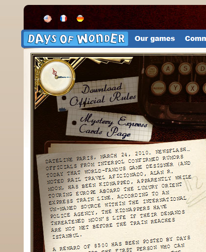
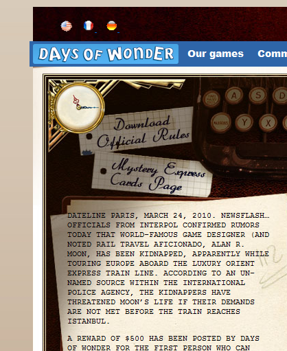
We often think about CSS3 as being in the future. This thing that we can never actually use. Well the folks over at Days of Wonder (or at least their web designers) didn’t think so. They are using the CSS3 on their page for their promotional contest for their new board game: Mystery Express. Check below the screen shots for the actual code they are using, and visit the Whodunit Contest site for yourself.
Chrome 4.1

Firefox 3.6

Internet Explorer 8

Here is the CSS for the Text (which by the way this is the largest site I have ever seen text twisted with the transform style.):
-webkit-transform: rotate(-5deg);
-moz-transform: rotate(-5deg);
-o-transform: rotate(-5deg);
transform: rotate(-5deg);
And did you notice the other bit of CSS3 on the page? There is rounding on the corners of the dark blue and at the very top. Again the code:
/* Rounded corners */
-webkit-border-top-left-radius: 5px; /* Safari 3 and up */
-webkit-border-bottom-left-radius: 5px; /* Safari 3 and up */
-moz-border-radius-topleft: 5px; /* Gecko browsers */
-moz-border-radius-bottomleft: 5px; /* Gecko browsers */
border-top-left-radius: 5px; /* Everything else - limited support at the moment */
border-bottom-left-radius: 5px; /* Everything else - limited support at the moment */
The text for Firefox looks fairly bad at this point. It has trouble with rotating text. Explorer has a different problem however, one that is not shown in the above screenshot. The text falls off the piece of “paper”! In my opinion they should have set the margins smaller for IE so that the black text would not run off into the dark brown background. Oh well. Apparently they only really tested in Safari (which I assume looks very close to Chrome) and Chrome/Chromium.
So where are you seeing CSS3 around the web?